Case Study: Economics of Mutuality
Interactive playbooks on a SharePoint knowledge hub

1 / 5
Step 1
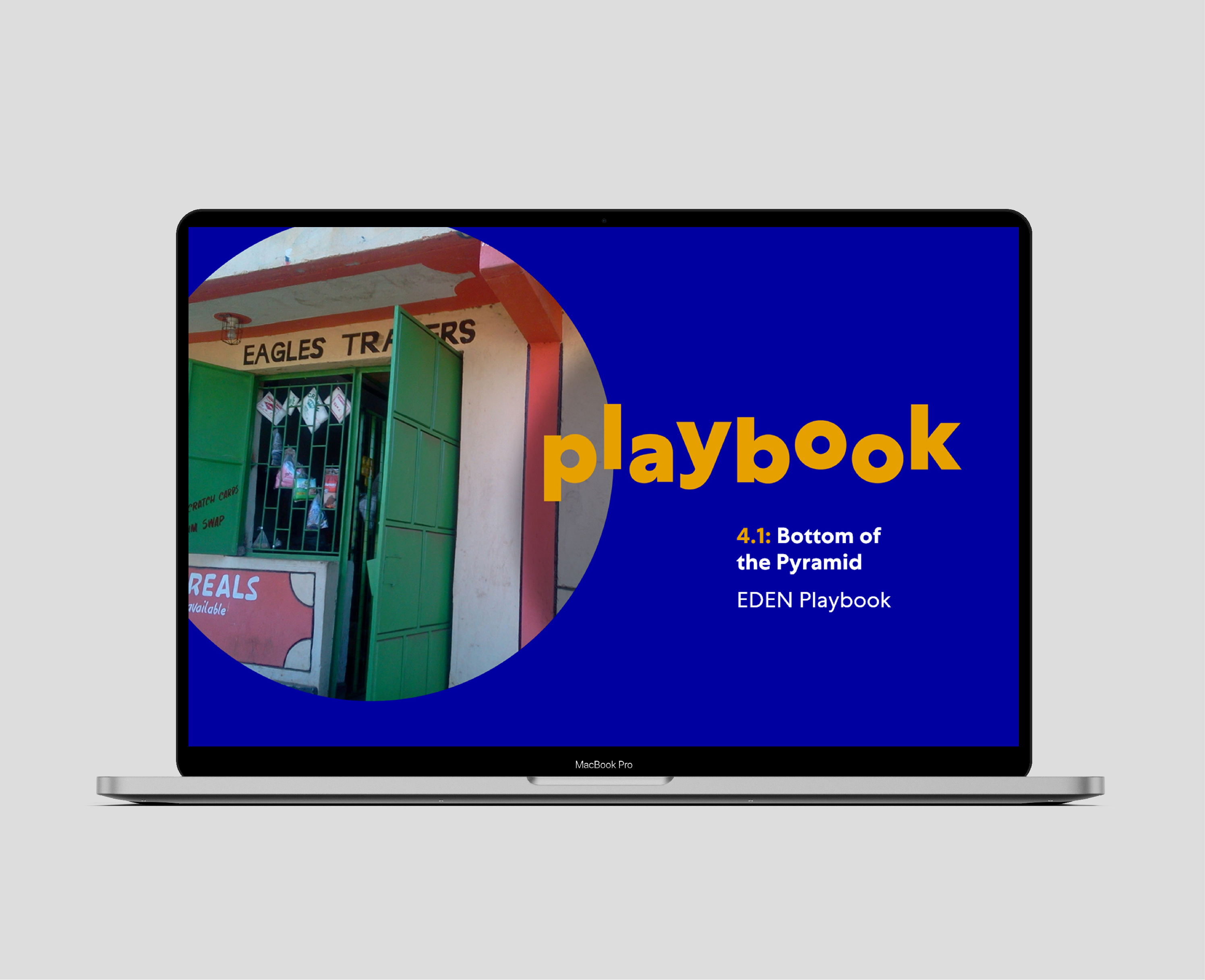
We were to create a digital knowledge hub containing a lot of presentations which needed to be visually appealing, interactive but remain editable.
2 / 5
Step 2
The hub needed to have a clear line of navigation with helpful instructions, access to reference material, videos and downloadable templates.

3 / 5
Step 3
With over 300 slides of the content for the main content delivery, we needed to be very careful about how to maintain the readers engagement.

4 / 5
Step 4
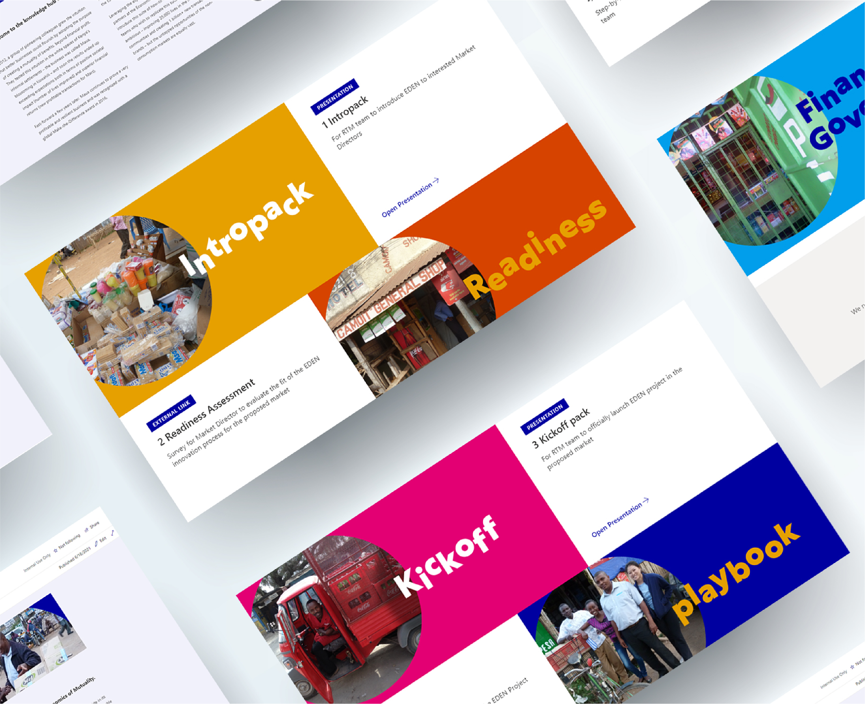
A custom SharePoint site was developed with interlinking sections and documents referring to other documents and resources held within the hub. Surveys, templates, videos, interactive sections and non-linear sections were used to keep the reader engrossed in the content.
5 / 5
Step 5
The project followed a tight delivery timeline but with some careful planning and organisation between our team and our partner we turned around a purposeful, great looking site overflowing with knowledge and opportunity to inspire the reader.
Read on below if you would like to know more…
The situation
Partnering with the Economics of Mutuality (EoM), the project was to create a knowledge hub for a major manufacturing business to empower and promote the benefits of a route-to-market for vulnerable communities. This would provide benefits to the communities from both a social and economic aspect which could also help the supply lines for larger businesses.
EoM have masses of knowledge for the market which feeds in as content for the project. This wealth of information needed to be developed into something engaging and presented in a professional way which was, in part interactive and bitesize. Meanwhile, everything would also remain editable by the client for future updates.
Prompts for Action
Initially solution options were presented as well as mock-ups of the design. From there we began the journey of developing the content as it was created by the subject matter expects.
We had elected jointly with our EoM partners to create a professionally designed SharePoint site which hosted a multitude of different editable materials, all linked together through some bitesize interactive presentations.
Furthermore, there would be a survey, videos and infographics which made the reader feel more involved and offered them opportunities to delve in further or progress in a non-linear fashion.
Consequences
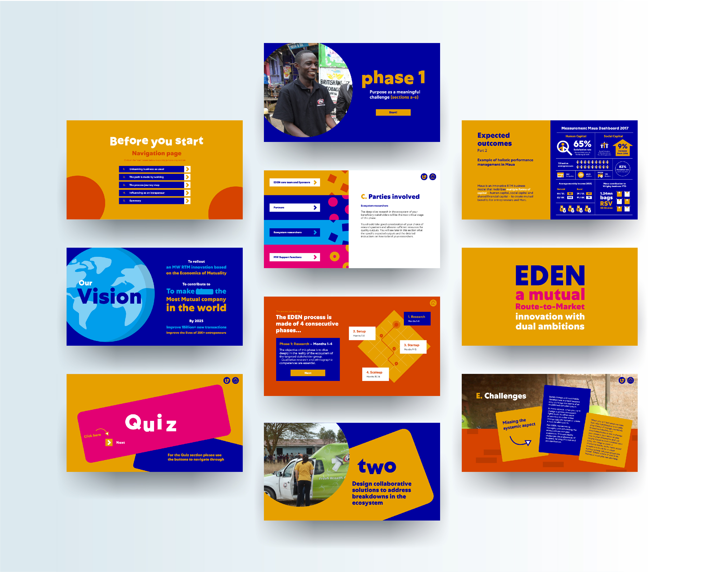
There was a risk that the quantity of content could get monotonous if the slide designs were reused – therefore a lot of variation on design was required. Due to the quantity of raw content being in excess of 300 slides and the timeline to develop being short, there would be a battle between efficiency and creativity of design. Therefore, more of the team would be needed to work on the project and a lead designer would need to be elected to keep a consistent design style across all material developed.
Keeping content editable is difficult when you need to be creative. Whilst being over creative with slides often making it difficult for the average user to update, a balance between the two had to be found.
Outcomes
The outcome was a tailored SharePoint site which felt like a nicely designed website. It contained a homepage that clearly signposted to the subpages and included bitesize modules within the site that signposted to pages which hosted a document viewer. This gives the viewer a fluid way of reading content from different sources without the need to download or open separate applications. It created a seamless connection with areas of interaction, references to outside sources of information, videos and downloadable documents and templates. This all helps to equip and empower the reader with everything they need to begin developing within the target community.
It was all consistently branded with a vast amount of different slide styles which keeps the reader absorbed. Version control and file protection was all setup along with permission groups to give specific owners the responsibility to update files.
Moral
The battle against death-by-PowerPoint was won! This was done by not only having nicely designed slides but through breaking up the content into sections, utilising menu systems, interactive slides and linking to other parts of the site to encourage a non-linear flow.
A great solution should not be limited by its modality. SharePoint can be very limiting with its options for design especially if you have restricted access to change features. The solution is to think outside the box to implement externally designed assets which all come together in perfect harmony.
